
Tutoriel : Comment créer un donut sur Tableau Software ?

Dans cet article, nous allons créer un graphique très populaire dans Tableau : le donut, doughnut ou encore graphique en anneau.
Un donut consiste à superposer un cercle à un graphique à secteurs. Un graphique à secteurs affiche la contribution de chaque montant (comme une proportion ou les chiffres de ventes) par rapport au montant total (comme les ventes annuelles).
L’avantage de ce type de graphique est la possibilité d’inclure des informations supplémentaires sur les données sous-jacentes (au milieu par exemple).
Attention cependant à utiliser à bon escient ce type de graphique. Il est justifié de l’utiliser si :
- vous comparez quelques éléments généraux ou déterminez l’importance de l’un d’eux par rapport aux autres;
- vous souhaitez présenter des indicateurs clés de performance (en % par rapport au total).
Si vous souhaitez l’utiliser pour un autre cas de figure, ce graphique ne serait pas le meilleur choix pour la compréhension de vos données.
Comment créer un donut dans Tableau ?
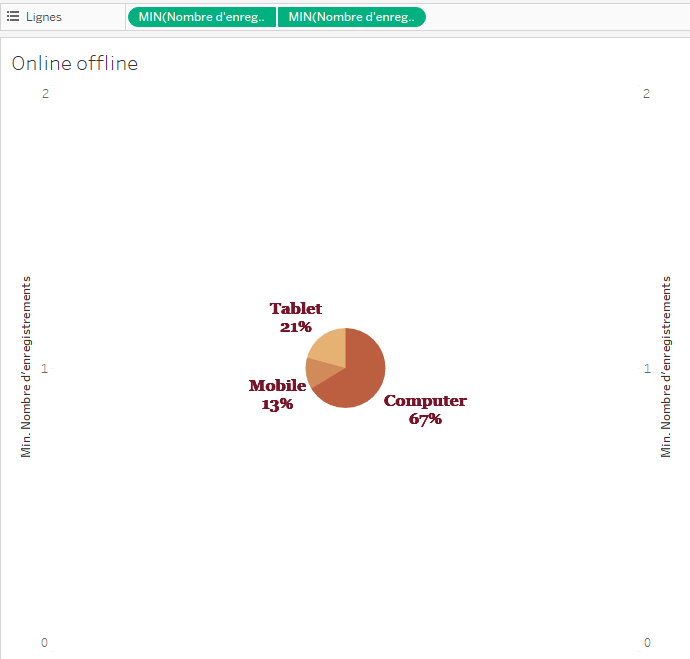
Le secret est l’utilisation de deux graphiques circulaires. Dans cet exemple, nous représentons la répartition de commandes en lignes (Proportion) par type d’appareils (Purchase online) d’un magasin.
1. Créer un graphique à secteurs (« camembert »)
- Dans Tableau Desktop, connectez vos données.
- Sous Repères, sélectionnez Graphique à secteurs, comme type de repère.
- Faites glisser Purchase online vers Couleur et Étiquettes.
- De même pour Proportion vers Taille.
- Cliquez sur Étiquette, puis sélectionnez Afficher les étiquettes de repère.
- Redimensionnez le graphique en camembert comme souhaité.
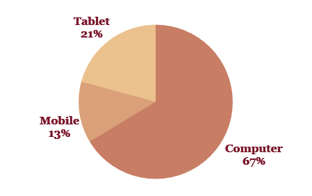
Vous devriez avoir un graphique semblable à celui-ci :
2. Passer à l’axe double
- Faites glisser Nombre d’enregistrements sur Lignes.
- Faites à nouveau glisser Nombre d’enregistrements sur Lignes.
- Sur Lignes, faites un clic droit sur les deux instances de Nombre d’enregistrements, puis sélectionnez Mesure(Somme) > Minimum.
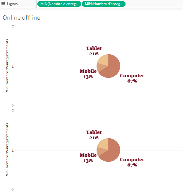
- Dans Lignes, faites un clic droit sur la seconde instance de Nombre d’enregistrements, puis sélectionnez Axe double.
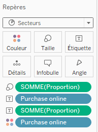
3. Changer le second graphique en un cercle
- Au bas de la fiche Repères, cliquez sur MIN(Number of Records) (2).
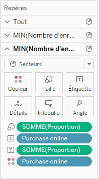
- Supprimez Purchase online de Couleur et Proportion de Taille.
- Supprimez les Etiquettes.
- Cliquez sur Couleur, puis choisissez la même couleur que l’arrière-plan. Dans cet exemple, cliquez sur Blanc.
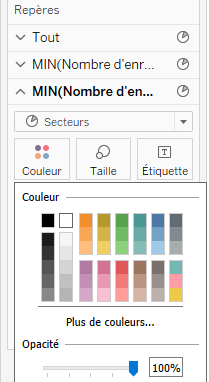
- Cliquez sur Taille, puis faites glisser le curseur vers la gauche pour réduire la taille du cercle.
- Cliquez avec le bouton droit de la souris sur chacun des axes, puis désélectionnez Afficher l’en-tête.
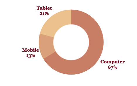
Votre donut est prêt à l’emploi !
Author Profile
Latest entries
 How To25 octobre 2019Comment importer une table d’Internet sur Tableau Software ?
 How To9 octobre 2019Comment personnaliser vos graphiques grâces aux formes dans Tableau !
 How To19 août 20194 étapes pour créer une hiérarchie dans Tableau Software
 How To6 août 2019Comment charger un fichier JSON dans Tableau ?