
")
Data + Design : the perfect combo for effective dashboards
Visual cues and user experience play an integral part of how we process, understand and retain information. This is particularly important when trying to transform raw data into actionable insights.
While designing dashboards can be a daunting task, it can be the key in promoting adoption and making sure it conveys the intended message and analysis.

Why use design for your data projects ?
- Make complex data more accessible, understandable and usable
- Present and communicate information clearly and efficiently
- Enable effective decision making
- Improve cognition by using graphics
- Select effective visualisations
- Understand and adapt delivery to the audience and environment
Make Better decisions with Tableau Data Design
Why size matters ? Both the « One Page » or « Dashboard » formats are the ideal standards recommended for optimal web browsing and to facilitate the readability of your dashboards. Picking the right graph is fundamental for comparisons, compositions or distributions.
UX plays a decisive role in storytelling : the layout of infographic elements inlfuences the message you convey. Considering all the data design elements when building your dashboard will help you create a functional and user-friendly design; this will make it easier to read and understand your analysis.
Data Design has a crucial role for insightful, impactful Tableau dashboards. It helps identify opportunities for growth and improving business strategies. Here are five key principles that you can use making it easy to analyse and actionable for end-users.
How to get your free data design audit ?
📩 To request a data design audit, please fill in the form below with the relevant information and we’ll get back to you within 48 hrs.
📊 Upload a screenshot of your dashboard (without your data).
🚀 Get your PDF report within 48 hours : we help you enhance your dashboards with valuable recommendations.

Dive into data journalism
Traditional reporting extracts data but is static, only providing a summary of information without much detail (ex : Business Object, Excel …). Dashboarding, on the other hand, is built to visualise and organise data in real-time with :
- Storytelling : translating your complex data analyses into a creative story for end-user.
- Data Journalism collects, filters, and presents information in an attractive way to explore data and easily create visual stories.

Mydral Data Design Resources
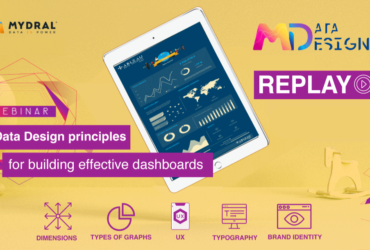
[Webinar replay] : Data Design principles for building effective dashboards
Bring design to your dashboards and promote data-driven decisions with Mydral's best practices. …