Tableau : discover the data competition Iron Viz with Mydral’s realisation
With the coming results of the #IRONVIZ 2020 contest on our doorstep, delibarations over the 4th of this month, it seems legit to make a retrospective of my first entry to this very instructive challenge.
Back to last year where all the troubles seemed ahead of us because of the actual sanitary crisis along with financial difficulties. For millions yet, the humanitarian crises like war and famine historically forced them to face the perible of moving to find a decent place where they could resid.
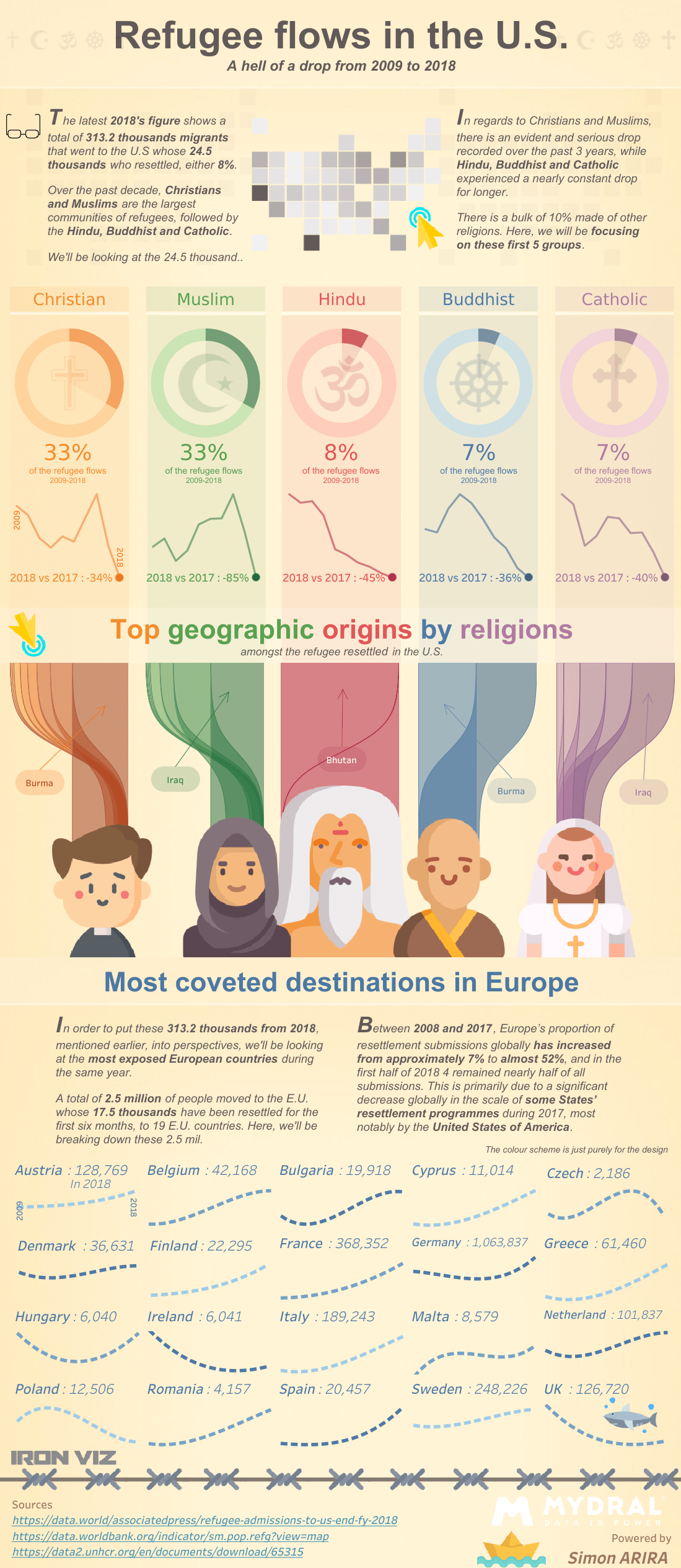
One of the qualifier annonced by @TABLEAU in 2019 covered this topic of migration into the US. Participating into an IRONVIZ does make you learn about the topic itself and definitely stimulates your interest.
Being my first participation, I have clearly underestimated the time it’d have taken to get familiar with the subject, the given set of data (and add external data to it), plan the analysis, the storytelling and get the design right.
Though I am not saying I have managed better my schedule this year round, I still got to participate this year.
First off, I tempt to cover the following questions : the what, who, where, when and how – mainly the first three. Most preferably a question by section which will then help to adress and plan the storytelling.
Usually opposing and comparing data elements in a visual manner helps the reader to grasp and comprehend the message easily. When possible, the narrative that goes along the visualisation will tell additional infos, more detailled. It does basically complete the visuals. The reader will find thoughts for food in both.
Here, I rather talk about the design aspect than the data preparation phase and so. Even though I whish I’d had the time to add another section…
Click here for the interactive version of the image below, on Tableau Public.
The esthetic aspect is also crucial, as the storytelling, to keep the reader interested in sliding through. The elements such as colour palet and contrast, font with normal vs bold, design and graphic elements such as icons, cohérence between the background theme and the upfront, to have a variation in the type of graphs used across the sections… All these aspects will put what matters in exergue.
In term of analysis, start with showing global info gives the context. In this viz, the first section answer the question What ? Migration in US – Who ? The type of religions that migrated – When ? Historical trend by religions.
In the middle section, give more detailled information for those who went convinced with the introducing part. Here, I cover where these migrants come from according their religions.
The last bit, as a conclusion, I put all these into perspective giving European figures. And here is where I wish I could have ended with adding a different approach to the topic such as law and latest news for instance that people could relate to. As always, time management is the key.

Posting your work on social media such as LinkedIn and Twitter is how you’ll get feedback from your peer and community. They can challenge your approach, what your saying through the anaysis and the design choices but it is all for the good reasons. The support you receive really boosts your motivation.
If you haven’t yet jumped in, I can only encourage you to get involved. You’ll get to improve your skill at all levels and your community recognition of good work.
LinkedIn post here
Twitter post here